ScreenGawk
The Costume Details That Give Three Tim Burton Characters Away
Prefer ScreenGawk on GoogleSee more of our stories in your results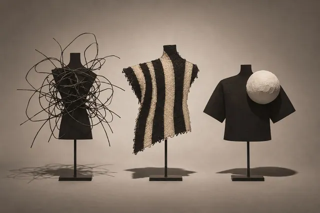
A silhouette is the earliest information a film can give a viewer. Before anyone speaks or moves, an outline on screen already suggests how to expect that figure to behave. Tim Burton's characters reward this kind of looking, and three of them make the point clearly: Edward Scissorhands, Beetlejuice and Jack Skellington. The Design Museum's exhibition on Burton's work follows his creative process from artwork to films and highlights recognizable characters, which makes outlines a fair place to start.
Take away the dialogue and see what each costume leaves you with. One character has an outline you could pick out from across a room. Another needs a little more light before a familiar pattern shows up. The third has such thin limbs that his round head seems oversized even at a distance.
Edward Scissorhands: the clue at the end of the arms
The first clue is at the end of the arms. Edward Scissorhands is drawn with blades where hands would be, and a viewer can pick out that clue from across a room: two long, spread, metallic shapes that break the ordinary line of a human figure. Around them sits a dark, buckled outfit and a mass of untamed black hair, so the body reads as a soft, narrow column with sharp edges at its extremities.
That combination sets up a tension before any story does. A viewer might reasonably read the outline as a figure built for cutting but wrapped in clothing that holds it in. What the outline cannot say is whether those blades are a threat or a burden. The silhouette poses the question and leaves the answer to the film.
Edward’s costume makes his hands hard to miss even when you cannot see what he is touching. The hands have to read from far enough away for a viewer to notice the space they take up around anything he tries to hold.
Beetlejuice: when the pattern does the work
Beetlejuice works differently, and the difference is instructive. A strict silhouette is a flat black shape, and the black-and-white stripes of his suit disappear in it. What remains is a head of wild, uneven hair above an ordinary suited body. So he is recognizable in two stages: the hair gives the outline, and the stripes confirm it once the surface detail is visible.
At a glance, a pattern can read as disorder as quickly as a shape can. Bold stripes are loud against a plain background, and a suit is a garment associated with order, so a suit that shouts reads as order gone wrong. It also explains why Beetlejuice suits a costume test better than a shadow test.
Stand too far back and finer clothes can dissolve into a single dark patch. A stripe thick enough to survive a little blur can keep the suit visible when the face is still difficult to make out.
Jack Skellington: a thin line with one accent
Jack Skellington has the plainest outline to describe. Disney's official entry for The Nightmare Before Christmas identifies him and calls him Halloween Town's Pumpkin King. The visible design is simpler to state: a very thin, tall figure with a round skull head, a dark suit and a bow tie shaped like a bat.
Because the body is so narrow, the silhouette is mostly line: long limbs, a thin torso and a head that sits on top like a single clear mark. A figure like that suggests height and lightness, and a viewer might also read it as formal, since the suit makes the skeleton look dressed for an occasion. The bat at the collar is the one small shape that survives in black, which gives the outline a detail to hold onto.
The bat does a different job from the collar on an ordinary dark suit. Its spread gives the head a small ledge to sit above. Look at the gaps between the bat and the long arms. Those spaces can tell you as much about the outline as the cloth does.
What a silhouette promises before the film does anything
One thing to look for is where a shape breaks from the background. Put two dark outfits in front of a dark wall and you may lose the edge of a sleeve. Move the people a few feet into the light and the space between an arm and a body appears. Once you can see that space, you have another way to compare the figures.
The very same lines can tell you different things once you understand the scene. Jack's height might make him imposing, or it might make him look like an overgrown figure at a party, dressed neatly and getting in everybody's way. The narrow shoulders and long arms leave room for either impression.
The practical objection is that an outline can mislead. A viewer who judges any of these characters by shape alone is making a guess, and the film is free to contradict it. A silhouette is a prediction, not a verdict. It is most useful as a first reading that the rest of the film tests, and a distinctive shape is no guarantee that a character will hold a viewer's attention.
Which credits to look for
The AFI Catalog lists Henry Selick as director of The Nightmare Before Christmas. It reproduces the credit for the story and characters by Tim Burton and lists Burton and Denise DiNovi as producers. 20th Century Studios lists Burton as the director of Edward Scissorhands. AFI credits him as the director of Beetlejuice.
Those credits are worth reading in order. Start with the director line, then look for a story or character credit. Check the producer line last. In Jack’s case, the first gives you Selick’s name. The other two tell you where Burton fits.
On a poster, there may be room for only one prominent name beside the film title. The longer credits can tell you more. They put the jobs into separate lines that you can compare across all three movies.
A two-second test, and its limit
Try this with a poster or a paused frame. Squint, or step back, until the detail drops away, and ask what is left. Then move just close enough to read a color or a pattern. The test works best when the outline does some of the work by itself. It works poorly for a character whose identity lives in a face or a voice.
The useful habit is to hold two readings at once. A silhouette tells you what a figure asks you to expect, and the credits tell you who made the film that answers it. Burton directed two of these three films, and Henry Selick directed the third. Hold both readings, and an outline becomes a starting point rather than a conclusion.